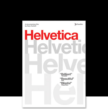
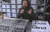
Helvetica is a feature-length independent film by Gary Hustwit about the font itself, typography, graphic design and global visual culture. It explores how, over the last 50 years, Helvetica has touched every part of our lives and how it has become a ubiquitous design icon.
The film contains interviews and opinion from many of the calligraphers, typographers and designers who have been involved with the creation of, use of and rebellion against Helvetica.
Thoroughly enjoyed the film and all the extra interview material. It was a rare opportunity to hear what generations of typographers and designers think of Helvetica and how they see its role. Eric Spiekermann, Matthew Carter and of course the legendary Hermann Zapf were truly inspiring.
I love Helvetica. It is such a versatile font family but I can see the need to express personality through typography and therefore, the necessity to choose appropriate fonts and encourage new type design. The big questions are will there be another Helvetica and will there be a sequel to this movie?
As a web developer I do not interact with different fonts on a daily basis, however, I do appreciate good typography. This film was a good introduction in to the most important typeface in todays society. The film follows the timeline of the font, from it’s inception 50 years ago, through a rebellion period and emerging as the ‘defecto’ font in everyday society (whether you realise it or not!).
I felt some parts of the film put too much emphasis on the importance of the font in relation to globalisation, commercialism and politics – even relating the font to the Vietnam war and the current invasion of Iraq. However, the segments by Erik Spiekermann, Experimental Jetset and Michael C. Place were interesting and educational without being pretentious.
The film is well shot and the cinematography of the stills which artfully reveal the use of the font all around us are beautiful.
More information about the film is available at helveticafilm.com
